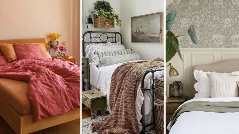
With a crisp new season upon us, it’s high time we get cozy at home. And since we’re refreshing the decor a little, why not try a hot new trend, too?
Whether you’re considering a full-on renovation or simply keen to add some fall feels with a new coat of paint, we’ve got some fresh-off-the-press intel from the pros who know.
Debuting a few eye-catching looks this time of year makes perfect sense. The holidays will be upon us in no time, bringing with them all kinds of opportunities to celebrate with family and friends in your (newly zhuzhed) home.
Want to jump in? Check out these seven fun fall trends and try one (or more) in your space.
1. Jewel tones
Neutrals will never leave us, but the pros say more saturated shades are on the rise this fall, including teal blue, royal purple, and emerald green.
“Moody jewel tones are in,” reports Kirsten Conner of the eponymous design firm.
The stars of HGTV’s “Unsellable Houses,” Lyndsay Lamb and Leslie Davis, have teamed up with Wayfair Professional to showcase these trends—and they say blues and greens are especially easy to try if you’re not sure which hue is best.
“Pull the colors you see through the windows inside—it’ll help you get through those dark months,” Davis says.
2. Granny-chic wallpaper
Designers just can’t quit the granny-chic trend. From “grandmillenial” to “coastal grandma” decor, these throwback looks continue to be popular—with the latest design element extending to paper for your walls.
“Granny wallpaper is definitely in,” says Conner. “In fact, all wallpaper is hot!”
You can go a million different ways with this trend, opting for traditional roses, delicate trellis designs, or bolder florals.
Hang your granny paper in a half-bath, laundry room, foyer, or guest bedroom.
Not ready to commit? The peel-and-stick variety is cheaper to put up, and you can swap it out when you’re ready to move on from the trend.
3. Statement lighting
Lighting as artwork is a genius trend—one that Davis and Lamb are behind in a big way. Luckily, this trend doesn’t need to break the bank to make a bold statement.
Simply swapping out your sconces or pendants is usually a quick upgrade that can make a significant impact, along with a change of paint color and cabinet hardware.
Lamb says she and her team “look at lighting right away in a room because it can often be a piece to design around.”
Her biggest pro tip? “Choose a light family, like wicker, for example, and then the rest of the fixtures within eyesight have a complementary look.”
4. The shade of umber
Umber is a quintessential fall shade, a mix of brown and yellow, that instantly signals the arrival of the season—and it’s trending right now, says Noel Fahden Briceno, vice president of merchandising at Chairish.
Umber also happens to be the color of the leaves outside and autumnal produce (squash, gourds), and it offers a lovely glow that softens a room’s decor.
“Umber is sophisticated and versatile enough to be used on walls, upholstery, and tabletop accessories, and it goes so nicely with olive green, aubergine, shades of blue and amber,” she adds.
5. Wood on wood
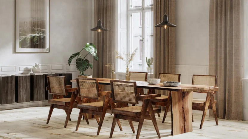
Wood is a way of bringing the outside in, much the way the Norwegian trend known as friluftsliv does. Try it in a small way with a simple rustic stool next to your bathtub or add a whole wall of chic paneling.
Davis notes that “wood elements work beautifully in home settings and offer a surprising amount of freedom when it comes to decorating.”
Want to use wood near water? “Ceramic woodlike tile or luxury vinyl planking can achieve the same look without the risk of water damage in a bathroom or mudroom,” she adds.
6. A statement runner
Stairway runners are a fun fall trend, Conner says—particularly ones that don’t shy away from getting noticed (think animal prints, ombre designs, and other wild patterns).
Bonus: A runner muffles sound in the house and adds warmth underfoot—another plus when the temps start to drop.
7. Quiet plaid
“Pared-down plaid” in the home is worth a look this fall, Briceno notes.
“It’s more a minimal and contemporary-looking version than what we’re used to when it comes to traditional plaid,” she explains.
So rather than huge buffalo checks in primary colors, she suggests opting for “more subtle, single-tone hues on a neutral background and focus on the patterns and geometric qualities.”
Article originally appeared on Realtor.com.

